
Improving Your Line Art - Tips On How To Achieve Higher Line Quality
 |
| Character by @Amanda_Hedgehog. Artwork done as commission and modified for the sake of this post. Here's the original one. |
There are concepts in Art that are usually associated with disciplines such as painting, shapes, forms, composition, tonal values, but oftentimes are forgotten when thinking about lines. After all, lines are more than just simple strokes of a pen or pencil on a flat surface. The line has quality, different styles, a meaning. Lines can indicate depth, form, volume, and value. It can make or break a piece.
Lines can be particularly difficult when we are just starting to draw as it requires accuracy but also looseness. It needs to flow and look confident in order to create a high-quality piece. It also needs to be simple for the sake of clarity and fluidity.
It's easy to feel lost when we are just starting out, not knowing the reason what we are doing does not look as good as the artwork of other artists surrounding us. In this article, I will be sharing with you some of the things I learned that helped me to achieve better line art quality. I strongly believe that the topics covered here will be extremely helpful in developing more confident, better-looking strokes.
Confidence
Confidence will make your lines look a lot better, I guarantee. It makes sense when you think about it because when we are just starting out, we have no confidence whatsoever. Hence our line art sucks!
What is a confident line after all? Heck, what's a non-confident line in the first place? The image below will give you a solid idea.

I love images because they say 1000 words without making the article too long and scaring readers away.
Of course, line confidence is related to muscle memory and the ability to draw good lines accurately by using your whole arm, which will not happen straight away. It requires some practice to develop your muscles to do those lines, but I find that it doesn't take that long to be able to achieve a good level of confidence with your lines. With 4 hours of gesture drawing a week, you should be able to see improvements pretty soon.
 |
| Gesture drawing I did a while ago using charcoal. |
You probably heard at some point in your artistic journey that "Less is More". That is usually true, especially when we are on the topic of line art. Simplicity is extremely appealing in art, even in seemingly complex pieces. We can also interpret this quote as "Less is Clearer", which makes it even easier to understand why simplicity is so important.
We can easily compare that with books. Books full of long inverted sentences, containing long and complicated words compared to texts with compact, concise and direct sentences are a lot harder to digest, and perhaps not even enjoyable. What do you prefer to read? An engaging fictional novel or a highly technical scientific article on quantum physics? We don't even need to go that far, just read some centuries-old books and you'll understand what I'm saying.
We enjoy simple! We love simple, and we seek simple! In art simplicity is fundamental.
Simplicity is a big player in appeal. The most appealing drawings and designs out there are very simple, yet smart.
One thing you can do to make your drawings more appealing and easy to read is sticking to just 3 movements when drawing: straight lines, curved lines in the shape of a C, and curved lines in the shape of an S. The alternation and opposition of these movements create lots of appeal, especially when a straight follow or opposes a curve.

Balance can explain this. The human body is structured in a way that the shapes make a kind of a zig-zag, where a curved line opposes a straight line and vice-versa. This opposition creates balance in our bodies. An even better example is our skeleton. If you observe it thoroughly, you will see how it's constantly counterbalancing itself with this zig-zag pattern.

The opposition of straight lines against curved lines indicates a flow of force, that follows a similar zig-zag pattern. Hence it looks so appealing when we apply this to our drawings.
Line Thickness
The idea of Line Thickness is to convey specific characteristics of an object, such as volume, overlapping, light and shadow, atmosphere, depth, and more. Something as simple as how thick a stroke is next to the other or how it tapers can greatly affect our drawings.
The key here is contrast and relationship. A thin line does not say much on its own, but when it's next to a thick line, it can indicate distance as it fades into the atmosphere. It can also indicate that it's the side of an object that is facing the light, while the thick line stays in the shadows. A thin line within a shape drawn with thick lines might indicate the texture of a specific material.
Some ways that generally work that we can apply different line weights are the following:
- Thick Lines represent the shadow regions of an object, while Thin Lines represent the light regions of an object.

- Thick Lines indicate that an object is closer to us in comparison to an object drawn with Thin Lines, further away from us.

- Similar to the previous point, Thicker Lines can also indicate an object is overlapping another object drawn with Thinner Lines.

- Thick Lines describe the big shapes of a drawing, while Thinner Lines are used in smaller objects and details. It's a hierarchy, where the biggest, primary masses have thicker strokes, and they get thinner as we go down to the secondary and tertiary masses.
 |
| Notice how the outlines of her hair and face are thicker than the lines of the nose, lower eyelids and mouth. |
- Thin Lines are very useful when drawing textures of specific materials, such as wood, rock, different kinds of food...
 |
| Notice the lines of the fibres in his wooden chest armour and horns. |
A drawing mostly composed of bold, thick lines will have its point of most interest in the areas with unusually thinner lines. The opposite is also true: in a piece where thin lines dominate, the areas with thick lines will draw a lot of attention. Alternation generally leads to pleasing results as well, having a thin line followed by a thick line and so on. Use this knowledge to your advantage and lead the viewer's eyes to where you want them to look.
Texture
 |
| Notice some cross-hatching marks giving a bit of texture to her suit and boots, as well as a bit of texture on her horn. |
Something that will add a lot of life to your line drawings is the implication of materials and textures. There are several ways of doing that, oftentimes including some cross-hatching or some fibre lines for materials more like wood and stuff.
Since this information is more of a little detail that adds life to a drawing rather than a fundamental shape or form, the lines should be significantly thinner than the rest as we covered above. You don't want the object's texture to steal the highlight of the stage, they're there as a plus.
The trick with texture lines is not only keeping it simple but also minimal. If you add too many of them everywhere, your drawing gets overloaded with information, loses clarity and becomes overwhelming for the viewer to look at. Contrast also plays a role here, you want some areas clustered with detail and other areas with little to no detail. We call these low-detail areas breathing room.
You could also take advantage of these lines to describe the form of that object a bit more. For example, I find that when drawing trees or cylindrical forms with a rougher texture, concentrating the texture lines on the edges and leaving the center of the object more empty emphasizes that cylindrical form. In rocks, you can use these lines not only to describe its rougher, more brute texture but also to indicate a transition in planes, giving a more tridimensional feeling to it.

Closing Thoughts
Hopefully some of these tips I shared with you will be helpful in some way. Some of you have expressed how some of my other posts have been helpful, and that makes me happy!
I always liked helping people out, it makes me feel fulfilled and accomplished, as well as useful and helpful to the community. I tried to include as much as possible in this post, but there are definitely things I am missing or that you want to know more about but I am not aware of.
I always liked helping people out, it makes me feel fulfilled and accomplished, as well as useful and helpful to the community. I tried to include as much as possible in this post, but there are definitely things I am missing or that you want to know more about but I am not aware of.
If that's the case, please feel free to reach out by either tagging me on Twitter or sending an email to satierfart@gmail.com with any suggestions of topics you want me to cover.
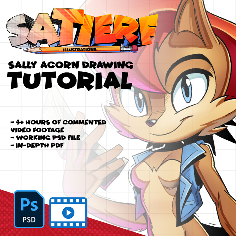
While we're at it, please consider supporting me by paying me a Ko-Fi! I am also selling there a 4+ hours long tutorial on my drawing of Sally Acorn, where I talk about a lot of what I mentioned here! You can purchase this little course by clicking here!
Cheers!!


Comments
Post a Comment